【CSS】画像を使わず、逆角丸(border-radiusの反対)を作る方法
まず、以下のサンプルを見てください。
See the Pen 逆角丸のサンプル by Uilou (@uilou754) on CodePen.
最近、こういう角を丸めたようなデザインのサイトが増えたと思いませんか?
様々な所で作り方が紹介されていますが、SVGを使ったり、clip-pathを使って作られています。
しかし、CSSだけでも作れたので、この角丸デザインを画像を使わずに作る方法をご紹介します。
逆角丸の解説サンプル
段階的にわかるようにサンプルを用意しました。
See the Pen 逆角丸の作り方 by Uilou (@uilou754) on CodePen.
逆角丸の作り方
まず、初めにdivタグで囲った画像を用意します。
<div class="container">
    <img src="~~" />
</div>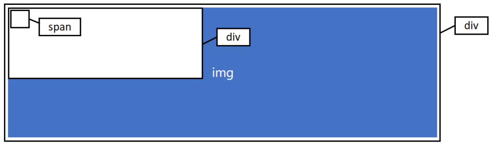
さらに、divの中にdivとspanを定義して、positionはabsoluteします。
<div class="container">
    <img src="~~" />
    <div class="news">
        <span class="corner"></span>
    </div>
</div>
.container {
position: relative;
}
.news {
width: 400px;
position: absolute;
}
.corner {
display: block;
width: 20px;
height: 20px;
}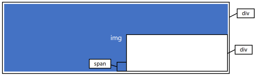
そして、top, left, right, bottomなどで、位置を調整します。
<div class="container">
    <img src="~~" />
    <div class="news">
        <span class="corner"></span>
    </div>
</div>
.container {
position: relative;
}
.news {
width: 400px;
position: absolute;
right: 0px;
bottom: 0px;
}
.corner {
display: block;
width: 20px;
height: 20px;
position: absolute;
left: 0px;
bottom: 0px;
transform: translateX(-100%);
}疑似要素(::before)に影を付ける
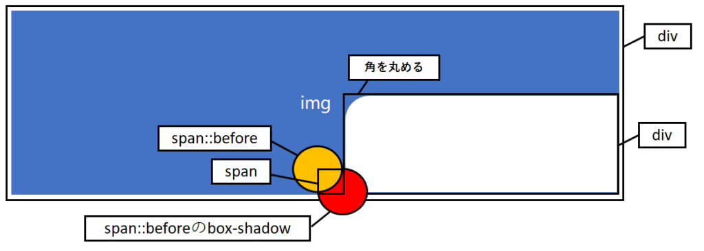
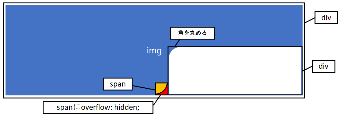
ここからキモです。
divの外に出されたspanの疑似要素をborder-radiusを使って丸くして、左上に配置します。
さらに、span::beforeにbox-shadowを使って、同じサイズの影を付けます。
これ、『::before』は使ってるから『::after』で良いじゃないかと思うかもしれませんが、box-shadowじゃないとダメなんです。filter: drop-shadowでもダメなんです。
<div class="container">
    <img src="~~" />
    <div class="news">
        <span class="corner"></span>
    </div>
</div>
.container {
position: relative;
}
.news {
width: 400px;
position: absolute;
right: 0px;
bottom: 0px;
}
.corner {
display: block;
width: 20px;
height: 20px;
position: absolute;
left: 0px;
bottom: 0px;
transform: translateX(-100%);
}
.corner::before {
display: block;
width: 200%;
height: 200%;
position: absolute;
top: 0px;
left: 0px;
content: '';
background: orange;
border-radius: 50%;
box-shadow: 20px 20px 0 0 red;
transform: translate(-50%, -50%);
}.cornerの疑似要素(::before)は.cornerの2倍の幅と高さにします。
あとではみ出した部分を消しますが、使うのは疑似要素(::before)の右下の部分なので、あえてはみ出るサイズにします。
そして、疑似要素(::before)にはbox-shadowを付けますが、box-shadowは.cornerのサイズ分位置をずらします。
影のはみ出た部分をoverflow: hiddenで隠す
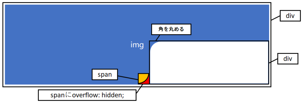
そして、spanからはみ出た部分を隠します。
ここはoverflow: hidden;でも、overflow: clip;でも大丈夫です。
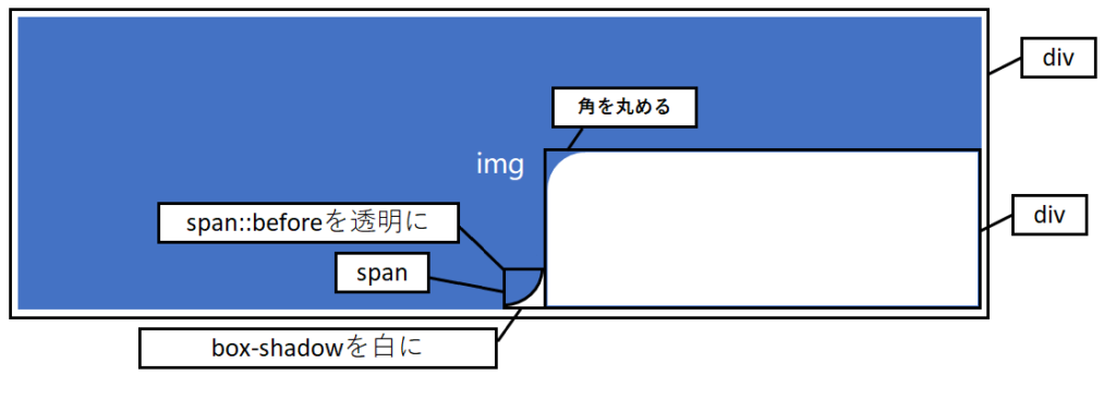
あとは、span::before自体を透明化して、box-shadowの色を揃えれば、完成です!
<div class="container">
    <img src="~~" />
    <div class="news">
        <span class="corner"></span>
    </div>
</div>
.container {
position: relative;
}
.news {
width: 400px;
position: absolute;
right: 0px;
bottom: 0px;
}
.corner {
display: block;
width: 20px;
height: 20px;
position: absolute;
left: 0px;
bottom: 0px;
transform: translateX(-100%);
}
.corner::before {
display: block;
width: 200%;
height: 200%;
position: absolute;
top: 0px;
left: 0px;
overflow: hidden;
content: '';
background: transparent;
border-radius: 50%;
box-shadow: 20px 20px 0 0 white;
transform: translate(-50%, -50%);
}box-shadowとdrop-shadowと疑似要素で影を作った場合を比較
試しに、box-shadowとdrop-shadowと疑似要素で作った影を比較してみます。
See the Pen 逆角丸の影の付け方を検証 by Uilou (@uilou754) on CodePen.
box-shadowで影を作った場合には、要素自体が透明でも、ちゃんと影が付きました。
これはbox-shadowが要素の形に合わせて影を付けてくれるためです。
あくまで「影」なので、本来要素がある部分はえぐれて表示されています。
対して、filterのdrop-shadowを使った場合には、枠しか表示されていません。
これはdrop-shadowは要素の中で色のついている部分にだけ影を付けるためです。
だから、背景が透過された画像(.pngとか)に影を付ける時には、filter: drop-shadowは超優秀ですが、こういう場面では使えないんですね。
そして、疑似要素のafterで影を付けた場合には、表示されるけど、重なっている部分がえぐれてくれません。
これではoverflow: hiddenを使っても逆コーナーにならないですよね。
そういうわけで、ここではbox-shadowじゃないといけないのです。
もしお困りごとがありましたら、お問い合わせフォームよりご相談ください。